Zwitserleven
Sonic Branding
CHALLENGE
Zwitserleven is a Dutch insurance company that offers a range of insurance products including life insurance, pension plans, and annuities.
It is known for its commitment to providing high-quality insurance products and services to its customers. The company wants to give a sense of security and trust to
their customers which is "the feeling of Zwitserleven"
The original audio branding for Zwitserleven was characterized by a high class lifestyle, a weighted feeling, and serenity conveyed through orchestral andante audio
compositions.
However, they want to move to a more inclusive and broader audience by becoming the knowledge base for everything regarding pension.
Therefore they strive to create a deeper positive connection with all kinds of people, and the natural world. This new perspective we reflected in their new sonic
branding.
THE NEW SOUND LOGO
The idea behind the new sound logo is to give a sense of belonging. It gives you instant access to a wealth of knowledge.
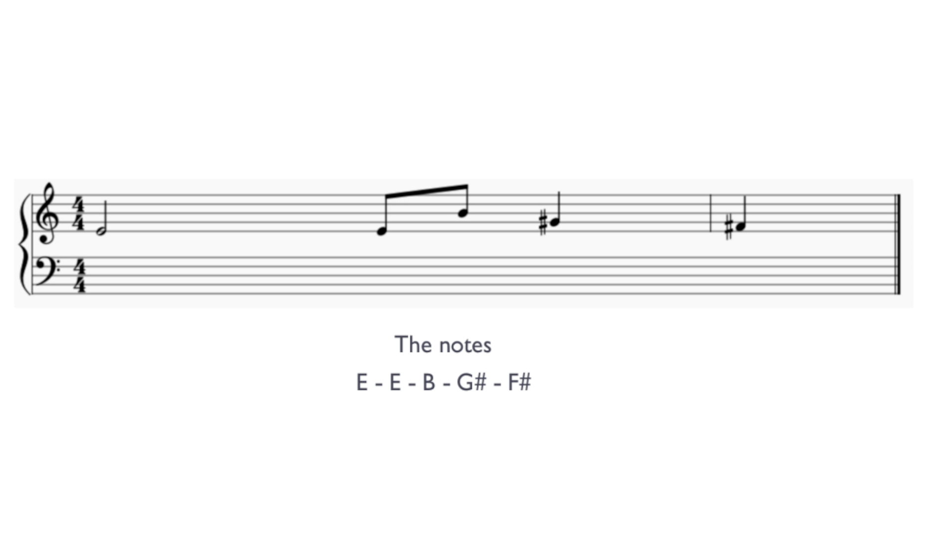
The new sound logo features a full “Major E chord” played by a warm and real cello, which creates a positive and more uplifting feeling.
It’s a open musical sentence, starting with the most clean interval; the fifth. It feels like you are lifted up at the end, it brightens up your view and creates clarity. The melody ends on the second note of the scale, which gives it an ongoing feel and doesn’t give the sense of closure.
ELEMENTS FOR THE BRAND THEME
We use classical acoustic instruments as they have a strong association with trust and humanity.
Using these or similar instruments results in engaging and open sounds. The use of major and pentatonic keys creates a world of positivity and possibilities. The tempo is slightly faster and more upbeat. Creating an ever evolving piano bed of a rhythm that feels alive.
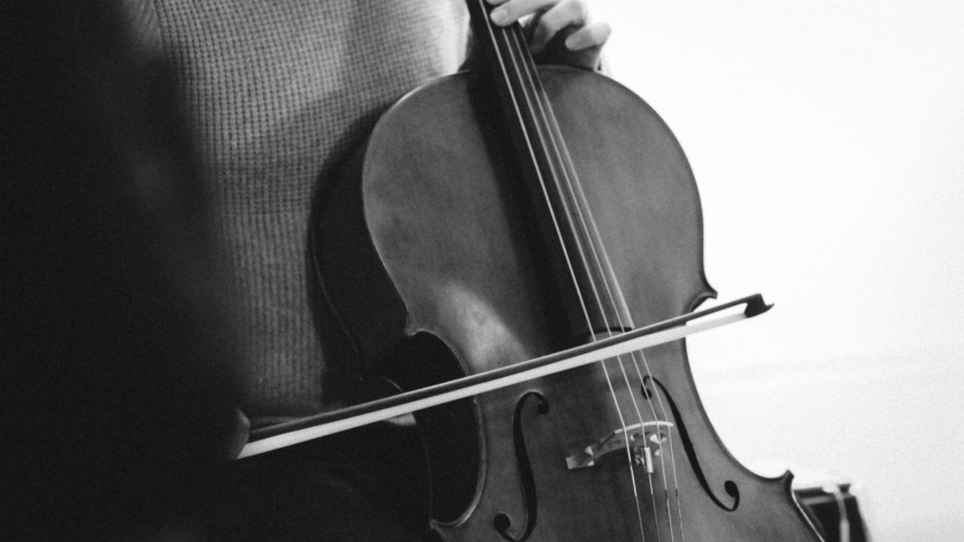
A melodic cello played by Jonas Pap, that plays beautiful notes in the key of life. keeping it light and major.
The repetitive piano pattern adds to the minimalist ambiance created by the lively upright piano.
Playful glockenspiel, light percussion and nature ambience to create a positive and youthful feeling.
SOUND DESIGN
We’ve given the sound design a consistent feel, using sounds that are tactile and real – from actual objects and instruments, rather than synthesizers. This creates a pleasant and familiar listening experience
Quickly spinning marble in a glass as sound for the clock to accentuate the circular motion.
A marble balancing on guitar strings, producing a gliding sound that fits well with a zoom in and out of the image.
A marble balancing on the glockenspiel produces a sequence of notes from low to high, which fits well with the ascending circle.
A marble balancing on the soundhole of an acoustic guitar produces a warm rolling sound that fits well with the rotating image.
BRAND THEME
For the brand theme we created an anthem sounding like a journey through life.
CREDITS
Animations:
Client: @zwitserleven
Strategy: @clarifynl
Animation: Else Wisslink en Nico van de Bunt
Copywriter: Joris van den Berg
Branding
Sonic branding: @THNDR
WE PROVIDED
Sonic Strategy
Composition
Sound Design